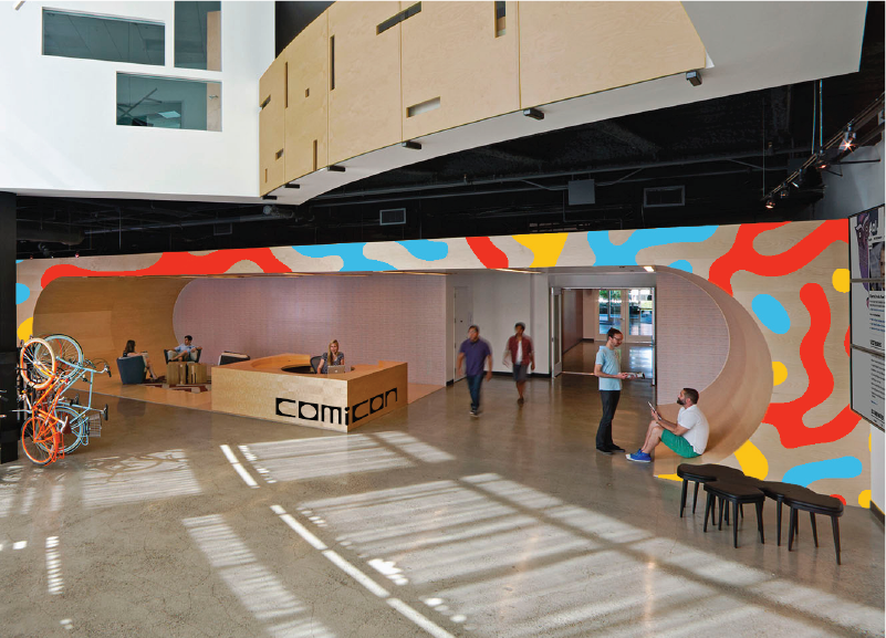
Comicon
San Diego International Comic-Con’s current branding hasn’t been updated since 1995. It uses color sparingly and relies on overt cliche comic book elements. With this conceptual rebrand, I honored the event’s history as the worlds first comic book convention while reflecting the magnitude of the event as the mecca of all things pop culture.
Scope
Logo Design
Event Collateral

For the logotype, I researched comic book structures and turned them into grids before experimenting with letter forms.