
Vangarde
Vangarde is a hypothetical hospitality brand extension of Vans. Rooted in Southern California surf and skateboarding, Vans has remained generationally relevant throughout the past 55 years. Despite this, they have found little success repositioning as a lifestyle brand. Therefore, Vangarde offers a nomadic surf stay that takes you to the best surf at the best times and brings Vans to life in new ways.
Scope
Hospitality Branding
Logo Design
Lookbook Design

Developing the Logo
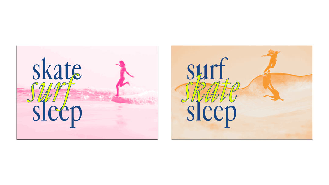
Started by skaters drawing on their shoes and popularized by Fast Times at Ridgemont High, checkerboard has become synonymous with Vans. To infuse Vangarde with a familiar feeling, I explored how to convey this pattern typographically.


Postcards & Patterns


Lookbook
By utilizing the image treatments from the postcards, I created a visual sense of breadcrumbs from page to page. Ultimately, this helped me transition the lookbook from black and white photos to full color imagery.


Overall, I wanted the lookbook to have an airiness to the layouts with some reference to the checkerboard. To achieve this, I gave the text adequate white space and used the body language in images to direct your eye.
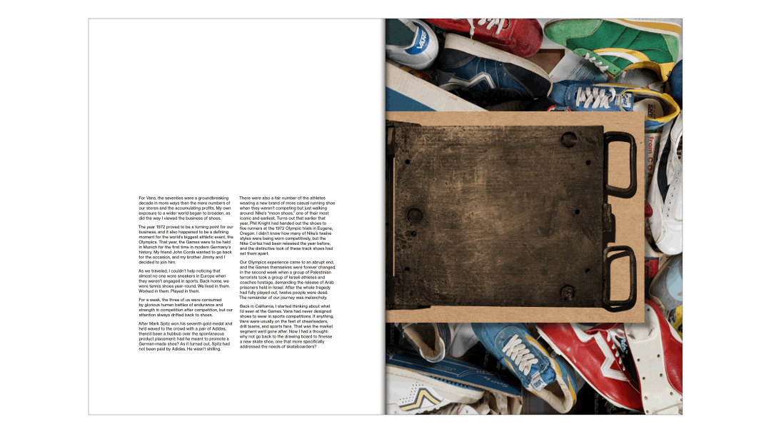
The lookbook also features a tip in of the manufacturing mold that Vans used to make their famous "waffle" soles for the original skate shoes. To capture the handmade quality, I selected kraft paper for this element.
Brand Activation
To have cohesion between each pop-up, there would be a clear branded visual experience that remains the same. One way to achieve this is through the employee uniforms.
Coveralls provide maximum freedom and unrestricted range of motion for employees while the addition of branded patterns make it easy for us to recognize them.


Just like quiet, reflective moments in surfing, the brand uses imagery in varying degrees of volume.
Thus these sunscreen sticks utilize the pattern as a surprise element that unveils itself when the product is used.


For the key fob, I chose something that patinas (showing in a way the many people that have visited) The keychain is also practical with a hex key for your fins, a screwdriver, and a bottle opener.
Environmental Design
The first proposed location is a pop-up at Aurea Hotel in Nicaragua, closest to the Playa Colorado surf. Each villa or room would be named after different Vans shoe models.


